|
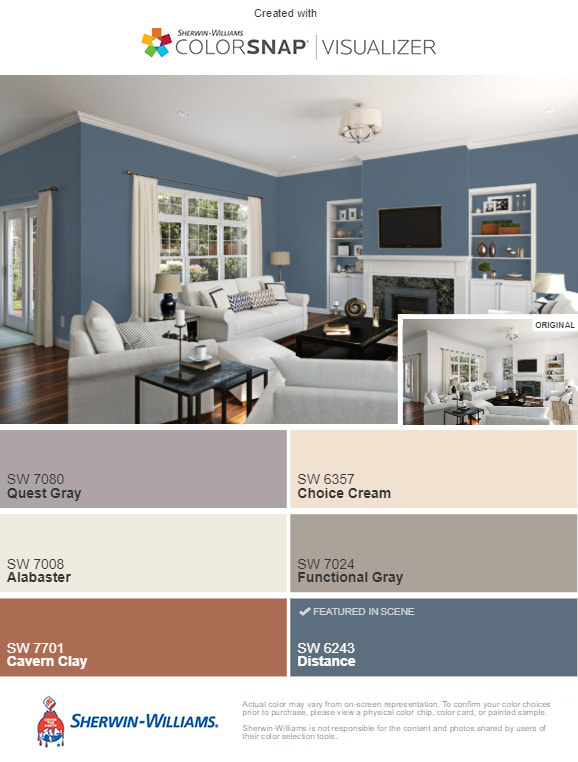
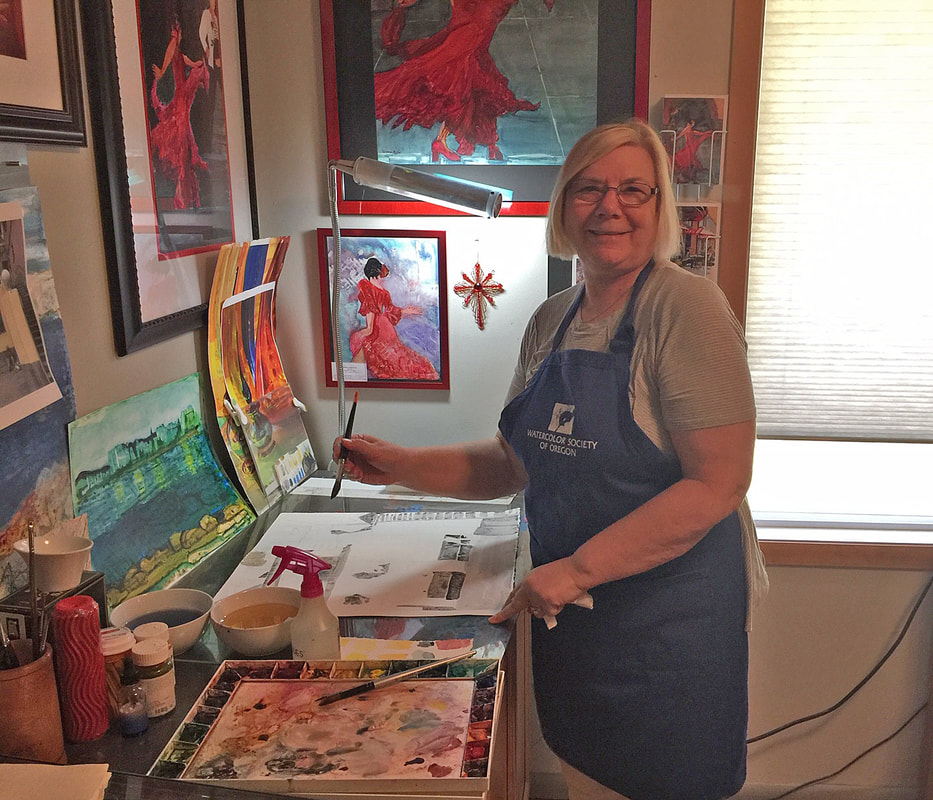
IDistance, our March Color of the Month, evokes the faded denim look of the 1970s. It’s a muted blue that balances light-tone wood finishes with ease, lending a vintage modern vibe. I have a very similar color to "Distance" in our Master bedroom and I find it very peaceful. The darker colors help your room be completely darkened so you get a better night's sleep. Most of my art looks good hanging on this color. You can never go wrong with one of the Gray's above either (which I have in my studio). Red dominated paintings stand out against the gray very nicely. Would you choose any of these colors for a room in your home?
1 Comment
|
AuthorSharing my paintings with others is one of the joys in my life. Educating others about how I paint and the media I use is very important and why I wanted to reach out through this blog. Hope you will add a comment about what you see. What else would you like to see here?. Archives
September 2020
www.dianagnadal.blogspot.com Link to Previous year blogs:
Categories |


 RSS Feed