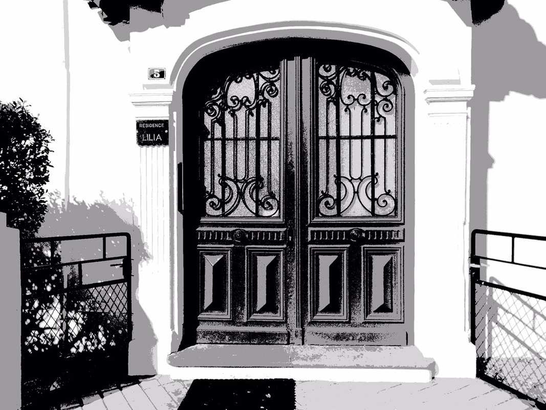
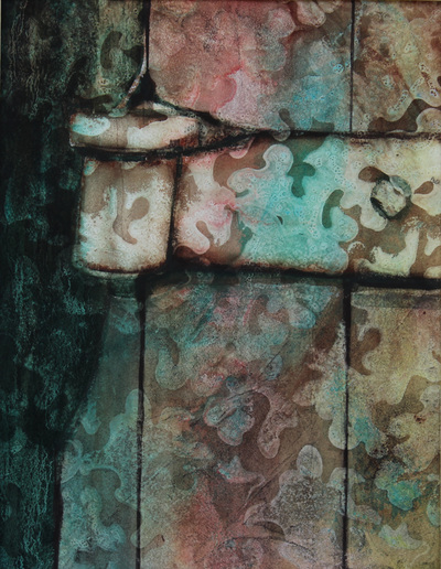
Sunday was spent looking through all our photos, particularly our travel photos. What sweet memories were brought back and got me excited to pick a theme for the next several months. I decided to work on more Doors of France because I can use different techniques, sizes, and surfaces-- paper, AquaBord, and Yupo. There are so many to choose from but I'm starting with the one below. I've done my value study -- and that is what you are seeing. Next I'll choose what 3-4 colors as well as what techniques to make the wall textures. I'm excited. Please stay tuned. Maybe you'll see some of these included in my 2019 Wall Calendar which will be ready in the Fall.
2 Comments
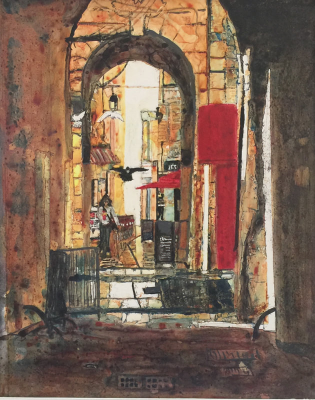
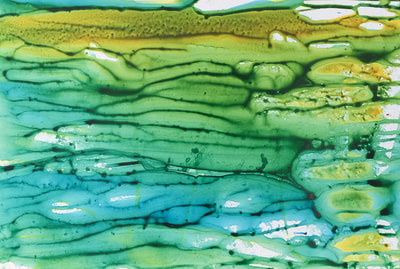
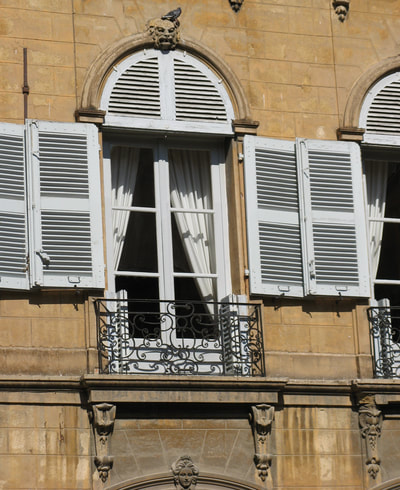
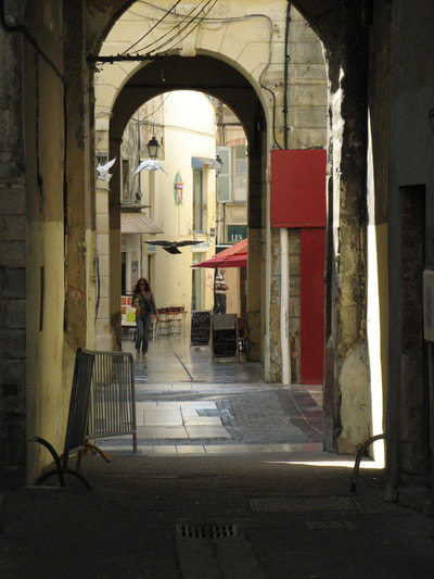
Well I said I would post my paintings from the 2nd 3-day Sandy Maudlin workshop. I love painting with the fluid acrylics and am still learning how to mix my favorite colors using this media. I probably could have used different colors for this so I didn't have to make changes to the yellow. Love how the lower left corner came through the process of masking each value layer before adding more intense color at each of the four value levels in this painting. It was time consuming masking each time but I think the end result is very unique and more abstract than I would have done with watercolors. This painting of an Avignon inner city side street was a little more complicated than I had planned. It meant a lot more masking for each of the four layers. I love the glow you get on Yupo and by intensifying the color through layering. Did you notice the lady scared the three pigeons? I'm painting it again on WC paper with watercolors so watch for the difference. Looking forward to getting your comments.
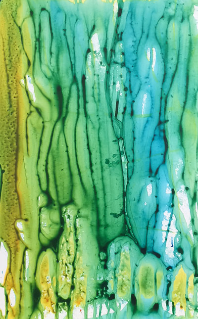
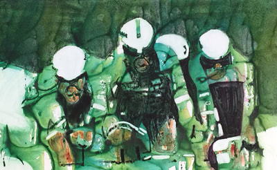
I forgot to take a photo of the cyclists before I started the process of exposing the whites and painting the darks. The two on either side was my 2nd pour done at the same time with the same colors. This was the first time I had poured with acrylics and so wasn't aware of how the colors would mix. I can't believe I got so much green because I started with yellow, then orange, then teal, and then a little phalto blue. I will learn more in the future but will stay closer to my favorite colors to use in this process to highlight the subject matter.
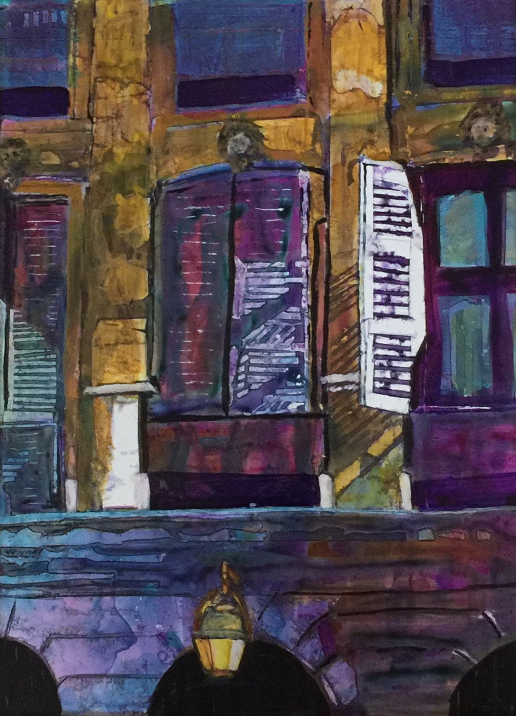
I am not finished with the cyclists but at least wanted to share with you because the process is so different than painting with watercolor alone on Yupo. The 2nd pour isn't matching any of the images I sent to her so will be either doing another pour over this or finding an image that will work. I guess I don't paint that many green scenes from my photos. I won't post again probably until Friday. I got sick from the alcohol smell with that many people using it, especially myself and those around me were using a lot yesterday to take off the acrylic. I'm hoping to go back tomorrow. Comments always encouraged and welcomed!! We were asked to submit images to her for both workshops. She sent back the ones she thought would be good candidates with a value black and white image of each. I missed the first day from the chemcial reaction to the alcohol from the previous two days, so worked on only one painting--the shutters on the building in Avignon, France. It turned out to be one of the most difficult to do with all the shutters being taped prior to painting each value. I but I did persevere. I'm just about finished and should be posting it soon. I learned a lot of different ways to paint on Yupo and look forward to a lot of exploration on this painting surface.
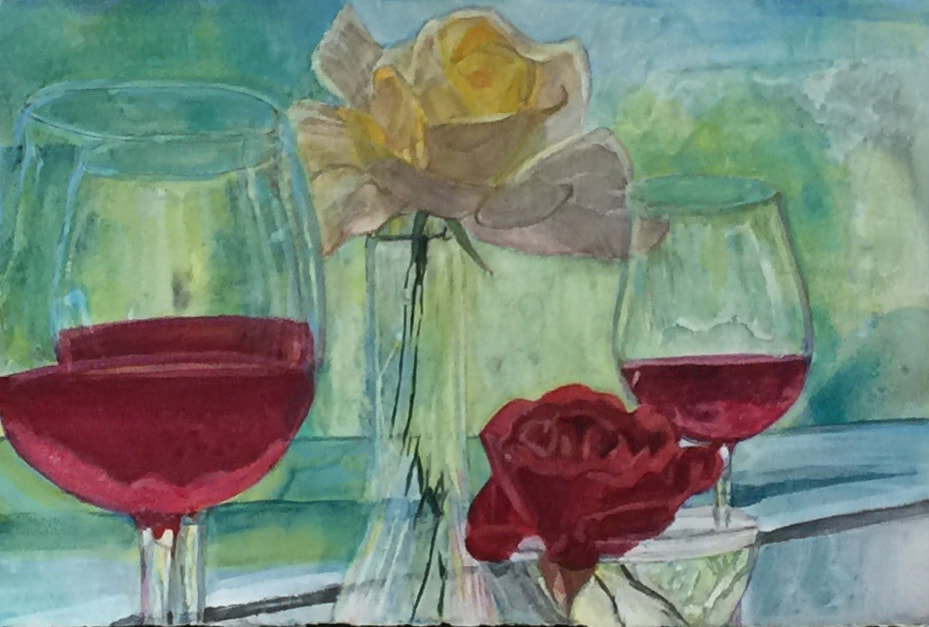
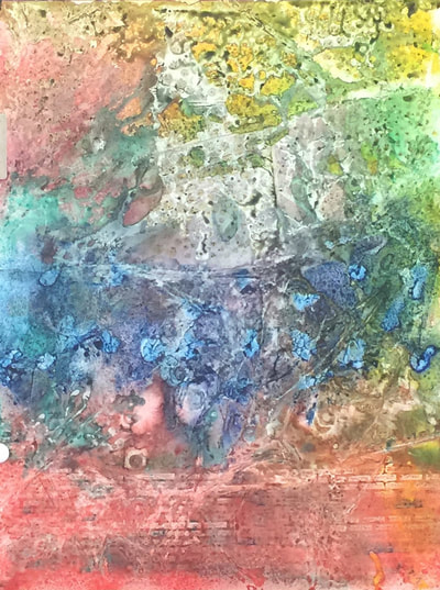
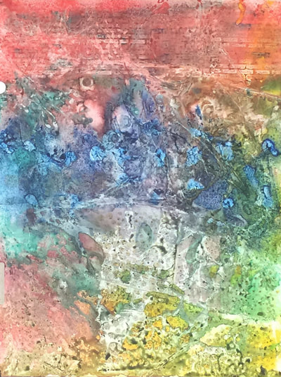
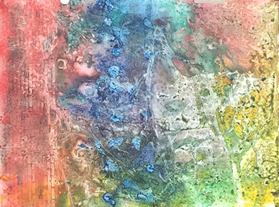
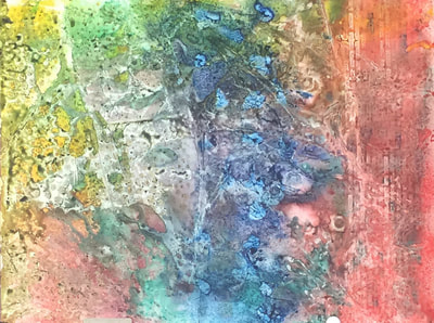
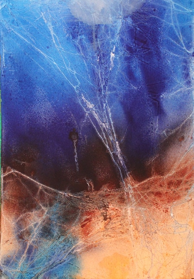
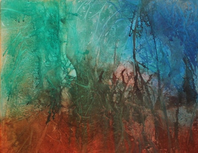
Just a reminder -- whenever you are painting in a workshop do not expect to produce your best work. It will take me some time to see if this "batik" technique is what I want to apply to my art. This painting from a photo I took of a still life I set up with wine and roses from my garden was started in March in anticipation of not being able to paint for awhile due to family member having surgery. I like to finish a painting while my enthusiasm and excitement is strong. I have used mostly watercolor but also added "gesso juice" to bring back some of the whites and give the painting some texture. I didn't finish and started working it again several weeks ago. I'm not quite done with the curvature of the wine glass on the right and the red rose might need some light highlights. It just felt good to get my brushes wet after so many weeks of not painting. Any comments are welcome . This was my first new start after the 8 weeks of not painting. It usually takes some courage to put those first strokes on the blank paper so I decided to go with a background under-painting on Yupo with webbing and spraying concentrated watercolors. I used a few more colors than originally planned so that added to how busy the background turned out. That is the wonderful part of painting with watercolors on Yupo--you can get back to the white of the paper by lifting what you don't like. When I start without a subject in mind I will look at the painting in different lights and turned different ways for several days. I often ask family members what they see in the painting as well. This one might require a lot of lifting to achieve the desired result! Paintings that were done like this can be seen in several of my "shoe" paintings and my first painting of the Peacock in Paradise done with webbing and concentrated watercolors sprayed.
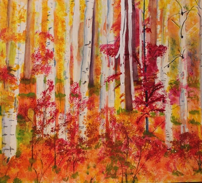
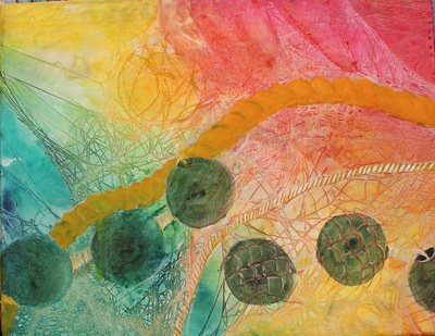
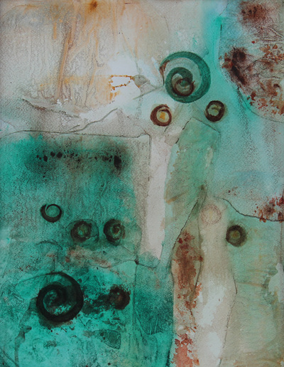
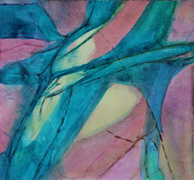
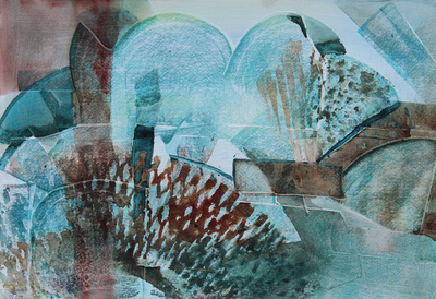
Image "1" - The first shape I saw was a white boot and not in a good place for a subject. When you spray through the webbing you can always get interesting shapes and faces. I can see a king or bearded man and I see several blue horses. Image "2" I can see making an abstract painting of cyclists riding towards us. Images 3,4: I might have to turn the bottom two paintings upside down to see something to build on. I would really appreciate any ideas that come to your "eye" too! So when you ask me how long did my painting take -- this is one reason it might be a lot longer time period than you were expecting. Painting is a process of creating something from your heart and feelings. It is good to get back after 8 weeks to doing what I love to do. 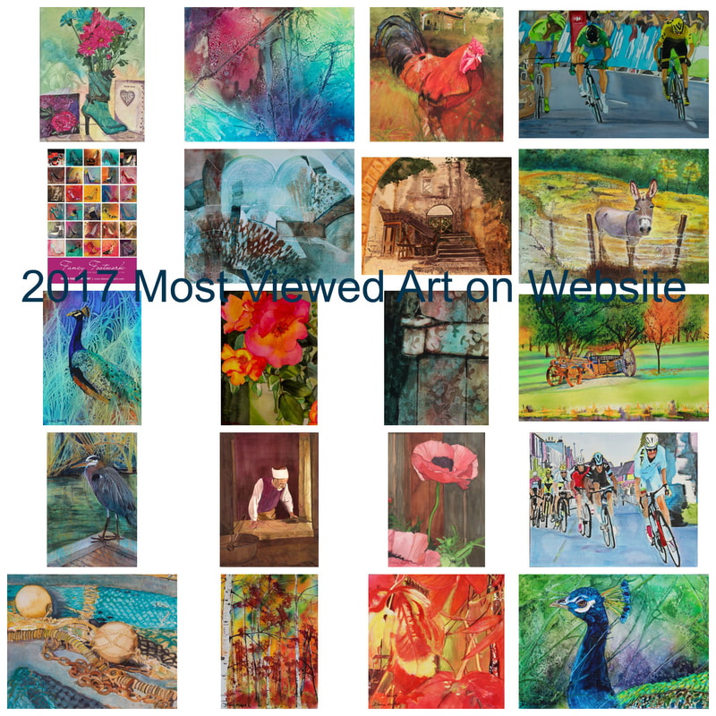 For the second year in a row I achieved my goal to have some of my art "on display" each month in a variety of places such as shows, juried competitions, galleries, libraries, and group shows in churches and Retirement Homes. I'm always looking for new places to display. So if you can think of a good place, please contact me. I believe that this exposure has led to an increase in visitors to my website in 2017 and the number of "views" which was 89,985! In addition I did increase my advertising on FB and Instagram which increased the number of new visitors to the website. It isn't surprising to me that the most viewed art has been in shows and featured in my News Tab. Here is my list of most popular paintings viewed: 1 Fall Colors in Forest* 2 Sagan Froome Breakaway Finish SOLD 3 Figures in Abstract* 4 Bird's Eye View 5 Fancy Footwork LIMITED Edition Print 6 Zanzibar Door Hinge 7 Gratitude Rose 8 Peacock in Paradise Aluminum Print* 9 NW Blue Heron* 10 Nibali Breakaway, Tour de France 11 Never Enough Love Celebrations 12 Antique Wagon, Chehalem Mountain* 13 Where Our Travels Lead Us 14 Poppy Stanting Tall II 15 Friendly French Donkey 16 St. Emilion Inner City Ruin 17 Floats and Nets Drying on Dock 18 He Rules the Roost II* 19 Custodian of the Rock 20 Fall's Bright Flame* __________ *7 of the top viewed paintings were in the Solo Show at Tualatin Library which comes down on February 5th. The "countdown to Christmas" special offerings didn't bring in the sales that I was hoping for compared to the effort to create the campaign. I believe it is still best for the artist to be present for sales to result. I spend a lot of time marketing each week and am still convinced that it will pay off at some point. It is difficult to keep up with technology and have the time to create. I'm still holding judgment to see if it is worth it in the long run. Looking forward to 2018 and what new developments in the economy help artists get back on a positive footing with sales. Your thoughts are important to me so please leave your comments. What I found very refreshing about the Paul Jackson 5-day workshop is that he tailor's each workshop to not only what is inspiring him but what he believes the workshop participants will enjoy. Sometimes a more experienced artist might not want to paint the same photo as the instructor and everyone else in the workshop but I found this time around it is important for the artist as well as the instructor to see if you are getting the results of his technique. The second image we were asked to create our own "story" and change or add our own images which was really using our creative juices and testing our knowledge from the first painting.
I do love to paint glass and so this was exciting to see how the layers of color come through with a brilliance and translucent glow of its surroundings. I thought initially it was the mixing of the colors but learned right away that wasn't how he achieves the glow.
I have been toying with the idea of creating a separate tab for my watercolor paintings which have been sealed with clear acrylic. The reason for doing this is so you don't have to frame with glass or acrylic. In fact you don't have to mat or frame when using canvas or cradles unless you choose to. Many galleries don't like watercolor art because of the glass or acrylic glare from lighting or sunlight in the gallery which affects seeing the art from a distance. In recent years I was told that if you sprayed or painted clear acrylic over your watercolors it then became mixed media. I have personally observed many watercolors sealed versus acrylic paintings which are often sealed in the same way and there is a definite difference in the appearance of the painting. You don't lose that much of the wonderful characteristics of a watercolor painting when you choose the right style and subject matter.
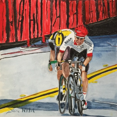
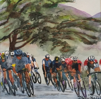
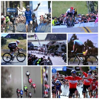
It is a labor intensive process for the artist but it saves money for the buyer in not having to purchase expensive acrylic or museum glass, mats, and then a frame. I like to still frame my sealed watercolors and love that Ampersand recently has added "floater" frames for their product line. I like that I can send the art out the door with the buyer and it is ready to hang on the wall with no further expense. Below are several examples of my painted which have been sealed. I normally seal them before they are photographed so I used my print website to show you the canvas and framed print idea. So do you think people looking for art would like to see these identified in a separate gallery? I would like to hear your thoughts. I'm working on a third in this newest series of cyclists during the Amgen Tour of California race held May 15-21st. One of these years I hope to be there in person rather than streaming and photographing live. I guess I am just a cycling fan who admires the tremendous physical and mental training and endurance to be successful in this sport.
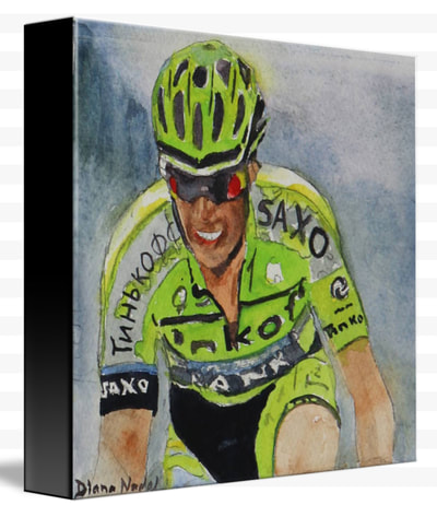
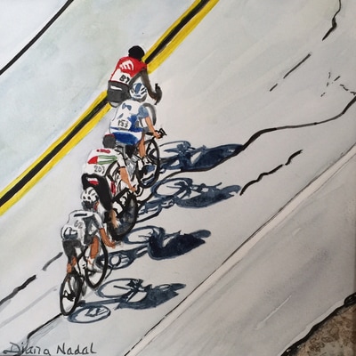
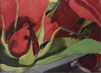
It is interesting to decide which of the many photos I've taken to paint. I started with Majka winning Stage 2 because he held the "Yellow Jersey" until the 7th day. He certainly deserved the recognition. They were meant to be quick sketches but if you know me they turned into more than a simple sketch. The 2nd painting speaks to my love of shadows and I've got many cyclist shadows in my files. I thought the design on the diagonal was especially pleasing and yet the painting is simple (I don't do that very often successfully.) I might do a few more before the Tour de France starts -- any of you cyclists who have photos you would like to have painted -- contact me. Please comment using the form below. I love to hear what you think Well we certainly have had April showers and it did bring forth many of the flowers and trees without much sun. Some of my favorite flowers do bloom in May: peonies and roses of course with the Rose Festival coming up in early June. I don't usually paint for shows but my roses this summer were spectacular and I think I captured several of my roses in photos I took. I might not be done with this one yet. Need to look at it for a few more days. I love to paint shadows and reflections in water so this met the mark.
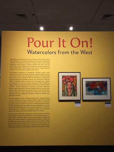
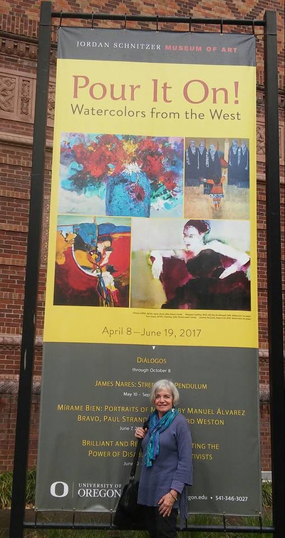
Please comment if you have a suggestion on title or on some changes you would like to see made. The actual painting is a little more vibrant than this shows. I have just returned from a weekend in Eugene, Oregon for the Watercolor Society of Oregon Convention in combination with the juried exhibitions of both the WSO and Western Federation of Watercolor Societies and their annual meeting. I am still feeling humbled this morning after seeing the exhibits all hung so beautifully with so many talented artists contributing to the show. I hope each person reading this will be able to see the Exhibition now through June 19th at the Jordan Schnitzer Museum of Art on the University of Oregon campus. Our juror, Jeannie McGuire, selected paintings which truly make this one of the best shows with 200 pieces of watercolor media you can see anywhere. Thanks Jeannie for all your hard work over the past couple of weeks and for the wonderful insight you gave us into your art journey. You have made my journey much more exciting by what I have learned generally and specifically about my painting in the show and my painting from the critique. So stay tuned for what will follow.
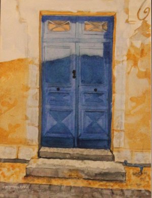
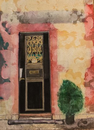
The show at Art on Broadway for March, "A Way In: Windows and Doors" motivated me to pull out my photos from our two trips to France. I had wanted to paint the doors in Bayonne since we found the Nadal Ancestor who lived there in the 1800s and the specific apartments she had lived in still as they were when she was alive. I loved the colors of this door since it represents French colors. I loved the shadows on the doors and from the lamp. This is the first in the series. Check out my "News" tab for going to see the show and the two paintings that were juried in of mine. In both of these paintings I wasn't satisfied with the texturing that I got from my usual techniques. The paintings were basically done but just lacked the color and pizazz I wanted to see. So I added "gesso juice" to the entire surfaces, except the doors. There is a lot of contrast in this second door which is very fancy and painted smaller than the first one. I think it improved them so I am happy. Both paintings are 15x11.
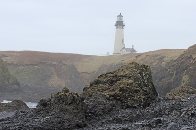
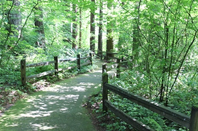
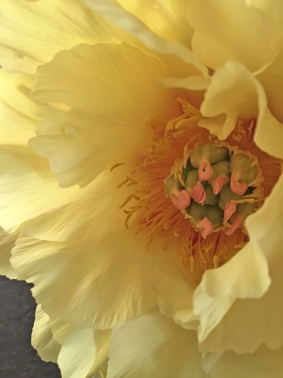
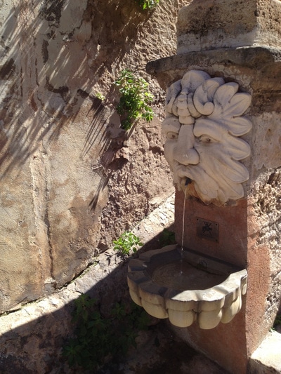
The first 4 are "starts" except the Lighthouse and Willamette Stone Path photos which are the images that I took my starts from -- no photos yet so I'll keep you in suspense. The lst three are tugging at my heartstrings to paint. It is easy to get scattered when you like to paint so many different subjects. I usually like to work on several paintings at a time. I'll keep you posted as I make some progress. Comments are welcome always if you have a favorite to help me choose........ I do respect your opinions.
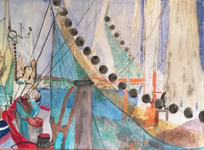
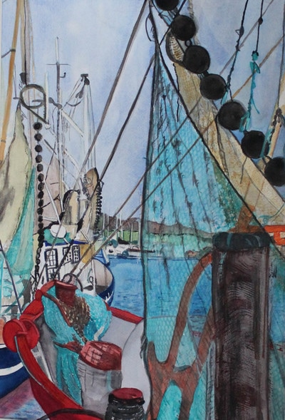
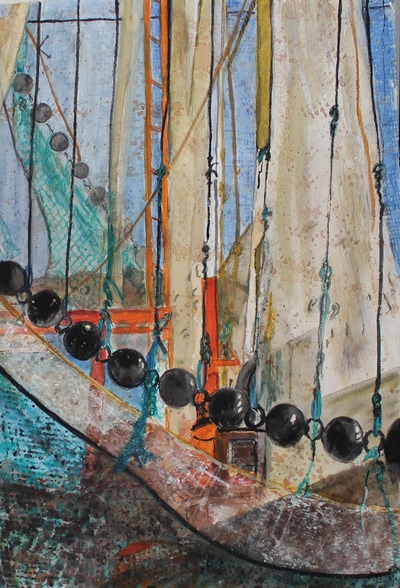
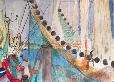
I was truly excited to get going on this painting before the end of the year but it was a very complex painting. So much for my simplify goal for 2016. Also, I didn't want to rush it. As I painted the details on the left half, I realized that I was really wanting to paint the right half because of the strong design which the nets and sails provided. I tore the painting in half and was much happier and delighted with the right half. I don't recommend cutting paintings in half or cropping them significantly unless you really are unhappy with the overall painting. So I ended up with two paintings, one of which I really feel expresses my inner feelings about the sails and nets of the fishing industry.
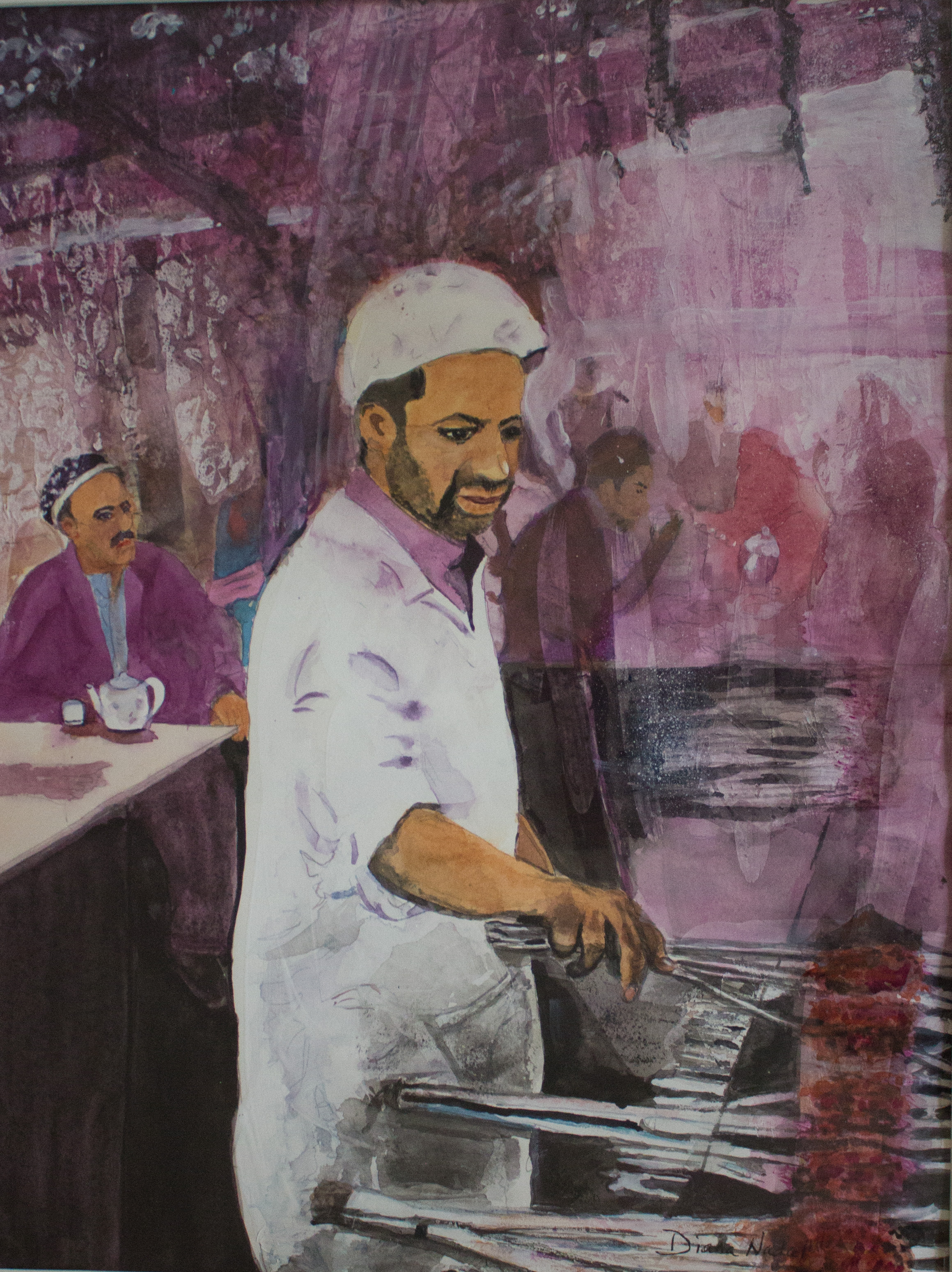
I would love to hear comments from any of you who have experienced the same thing or what you think of the paintings. Did I do the right thing? I have been wanting to paint this man for about 10 years. I've looked at the photo over and over until I finally got the brushes wet to do it. My creative juices were somewhat stifled by all the negative news surrounding the election but it was a good diversion for me because you have to be positive to create!
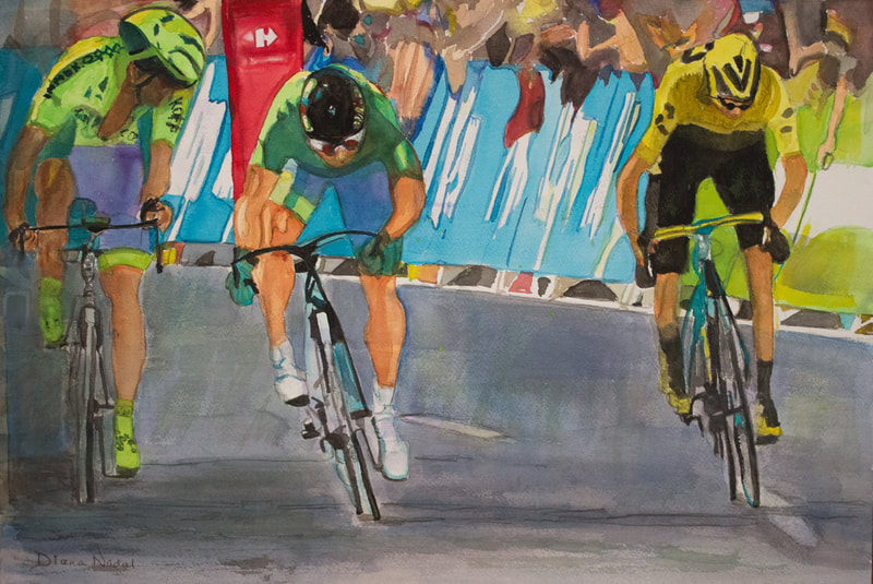
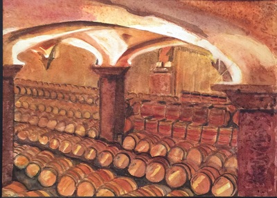
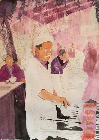
I started with different textural techniques and a couple of stencils using my gesso juice mixture (Gesso and Mat Medium with a little water). I let it dry and then focused on the man on the left and the dark shapes around the Chef. I decided to keep the colors simple and even though I consider him very masculine I chose varying hues of quin magenta. I found myself feeling very excited to get his face completed but took my time. The meat on the grill took a lot more effort than I expected. I had to subdue the people eating in the outdoor restaurant because they were taking away from him. I had to work on the squewers at the end. Thanks to my critique groups for the final suggestions. I would love your comments.... I've been tweaking these two paintings for since I last posted them. Finally am finished and happy with the results. I submitted for jurying the cycling painting from this summer's Tour de France to the spring show of WSO. I'll find out in late December if it will be accepted or not. This was a significant moment I selected after viewing the Tour for 27 days when in Stage 11 Froome (leader of the Tour in the yellow jersey) and Sagan (leading the point count for the Green Jersey which is the sprinters jersey) each broke away from the Pelaton early and stayed away until the finish. They each had a teammate looking out for them. I guess it had never happened before. It was a surprise to see them both sprinting at the finish but of course Sagan took the win. I hope my excitement for this awesome sport and event comes through in this painting. I do like to paint action sports. UPDATE: It was accepted and please watch for exhibition details in April at the Museum of Art on the University of Oregon Campus beginning April 7th. The wine cave painting is part of my latest series of wine related scenes and hopefully I can get these hung in some establishment soon. I'll keep you posted. I love how all five of our senses can be awakened in a wine cave. The smells of wine, limestone, dampness all add to the excitement of finding wines aging in barrels and bottles just waiting for someone to purchase them. Of course we always did make a purchase. The walls of the old caves are hard to see in the dim lights but this cave had really good lighting so I wanted to focus on that so the cave walls could be enjoyed as well. These are two paintings I have started in the past couple of weeks. I always need to be working on several so I don't get in a hurry and mess up.
The first painting looks really spooky right now which is why I went ahead and posted it -- HAHA Halloween! I don't fill in the facial features until I have a little more of the background done but I am pretty excited about this one. I started by applying gesso/mat medium mixture using different rollers and stencils. When it was dry I could then start applying the watercolors. I wanted to put some of the darks in to see how much more will be needed to balance the painting. I am trying to stay in the purples/pinks/grays contrasted with the whites of the main character. It is nice to take it slower than I usually do. My boat and nets painting is more complicated and I've tried to work on small sections at a time. All the details under the nets as they hang had to be painted first and there is still a lot of detail to be completed. Just wanted you to know I'm still here painting away. Comments are always welcome as well as questions. I took the 5 day WSO Workshop with Kathleen Conover several weeks ago in Silverton, Oregon at the beautiful setting of the Oregon Garden following the spring convention of the Watercolor Society of Oregon. I have primarily been a realistic painter and for the past several years was venturing out by creating abstract design in my backgrounds but still keeping a focal point that was realistic. I can share with you that from the minute I heard Kathleen speak about design and composition I knew that I had strayed from my basic foundations learned years ago. I guess I thought I didn't have to follow the steps on paper as long as I had a plan in my head. I was fooling myself. I will now have a plan before I venture to the paper with my brush, mostly because our brains can trick us away from following our plan. It was a very intense but worthwhile 5 days of learning -- often outside my comfort zone. We had "starts" in the workshop and three were close to being finished. There was a lot of lifting and adding paint but I am very happy with the results. It will be fun to see what comes out of my studio next--allowing myself six months to really work through all the information I have been given and see where it leads. Thanks you Kathleen for your outstanding teaching!
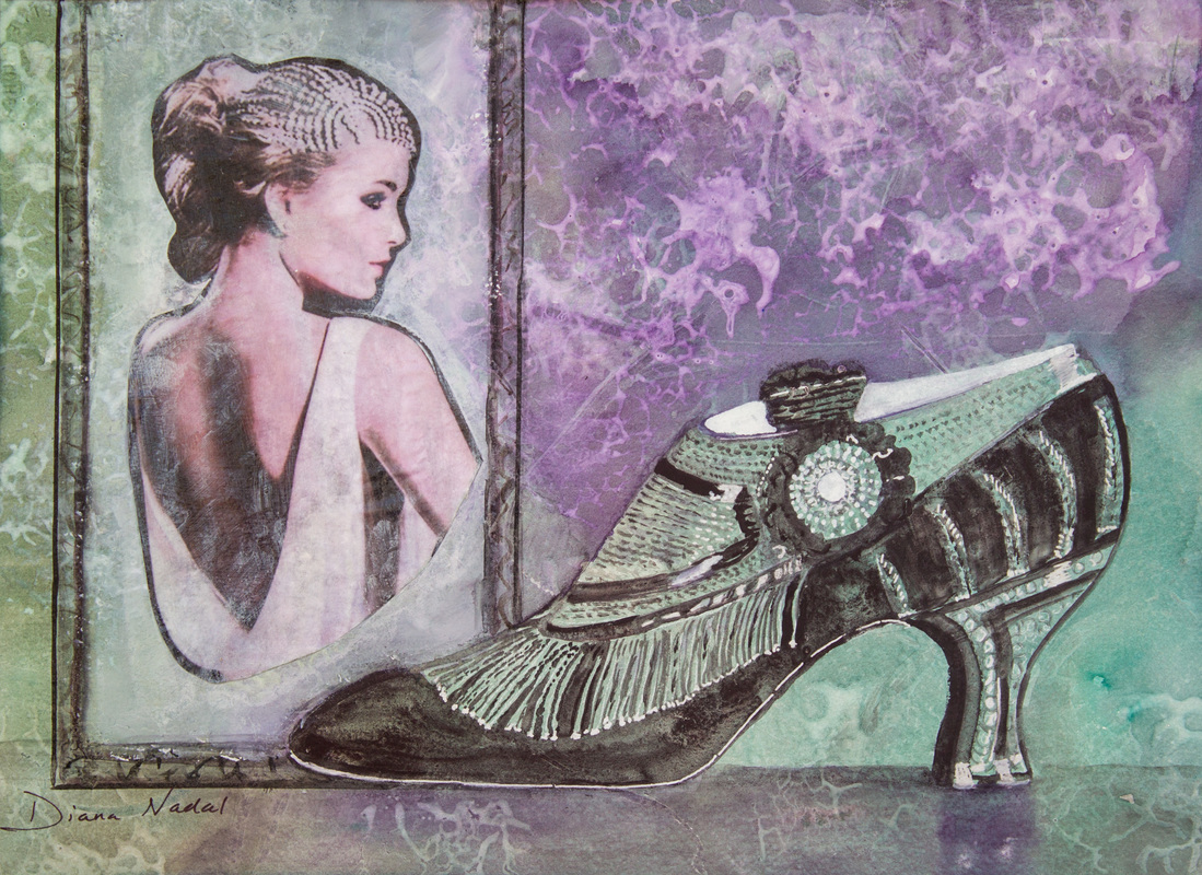
This painting started with covering the watercolor paper using a wallpaper design tool rolled across the surface with gesso juice mixture. Once dry, I applied the watercolors which gave an overall design in two tones. I knew immediately that I wanted to paint a 1925 shoe image which had been requested by a very dear friend (Thanks Kathy Gray). I didn't have all my paints with me but used a silver pen on the shoe. I loved that the background comes through in between the silver and black paint. I had thought of doing the other shoe in the background but it just didn't reflect what I wanted to say. I searched for period accessories and really anything from this time to add as a collage. I loved the headpiece of the lady in this painting which seemed like something that the woman would have worn as part of her outfit.
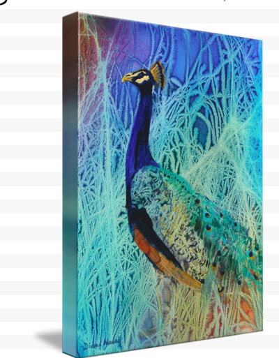
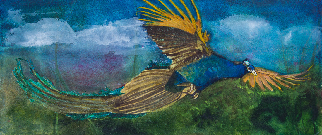
The next step was a first for me. I applied mat medium to the front of the female image and let each layer dry -- 6 coats in all. Waiting 72 hours to soak and lift off the acrylic tray I used and then scraping off the paper from the image. I let it dry but had to scrape a few more times. Finally I decided to put her in a period frame (which actually is a door in France). and added white watercolor inside the frame to create the mystery and aging to the photo. I used more mat medium top and bottom of the photo -- not sure that was totally correct but it worked. Now I need your help in naming it. The person who comes up with the best title will get 5 fine art cards when I have them made in a couple of weeks. CONGRATULATIONS Dee Rommel for suggesting the title I thought expressed what I wanted to convey in this painting: LOOKING BACK, "THE DANCE." COMMENTS are always welcomed!! 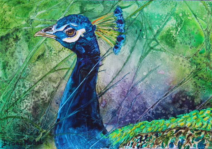 I still have a couple more paintings in the Peacock series. I took the time off from painting them to attend a workshop with Kathleen Conover -- paintings to be posted next post. I'm very interested in the detail of the head and the crown, particularly the eyes of the peacocks. The colors are always so beautiful that I can't resist painting. The first painting is done on Yupo and so the colors stay true from the first application. This one gave me the opportunity to add my vision to what I saw in many different photos we have taken as well as others. Bird's Eye View The second painting is one I've been waiting to paint. I really do like painting different shapes -- especially the long horizontal ones. When we were in Palos Verdes last Fall I saw this "dragon-like" bird flying across the sky while watching our Grandson's soccer game. In the B&B where we were staying they flocked to this giant tree. We came home each night too late to see them fly in but I got up early each morning and saw a few of them up in the tree and a few flew away but none were large males. I'm looking forward to our next visit because I'm determined to catch one in flight. Modern Day Flying Dragon Yeah -- I did start 3 days into the Challenge and reworked two of my paintings but I managed to get 27 completed. It was really fun painting them, fun getting likes and comments from people on Facebook that I know and new friends who were following me as well. I'm looking forward to viewing the artists who participated on the Challenge blog because when you put them altogether it is really fun to see.
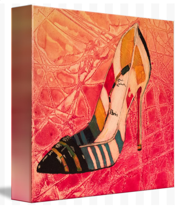
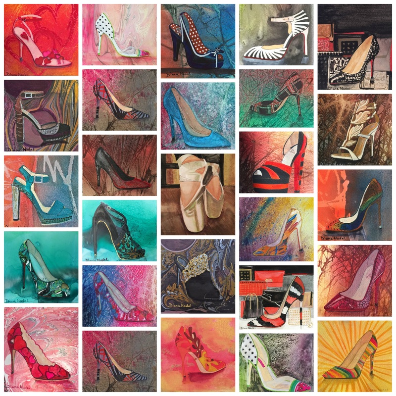
All these paintings are 6x6 except the Ballerina Toe Shoes (20x16) and the Orange and Black Striped Pump is 12x12. I like to paint on different surfaces so some are on AquaBord 2" cradle Yupo Marbled Paper I had done a couple of summers ago on different kinds of paper, Old paintings were revived by cropping the part I liked for the painting I love to paint on Fabriano 300 lb paper the best when using Dr. Ph. Martin Hydrus Watercolors. Most of these will have to be sealed before mounting on a 2" or 3" cradle. The Yupo paintings actually look better under acrylic or glass. I could put any of the ones on watercolor paper under glass in a frame as well. We'll have to see if the potential buyers want something specific then I can accommodate their wishes. I do have three other shoe paintings done this past year which are also available and are mounted and sealed already. I'm thinking of doing a poster print or some other way of reproducing a grouping of the shoes, not necessarily all 27. I might also do a calendar for 2017 if any of you are interested, please let me know. Voila! Today is the final day of the Challenge and I'm sad and happy at the same time. My family will definitely be happier when there is not so much painting going on "under the gun," so to speak. This has been an awesome experience for me and I hope a fun one as you have followed me through the days with different shoes, "pumps" being posted. When I post the entire collection tomorrow in a collage I hope each of you will take the opportunity to look at them and it would really be fun for me to have a voting of which of the paintings were you top 2.
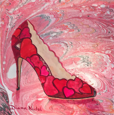
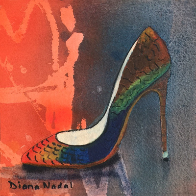
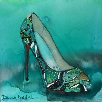
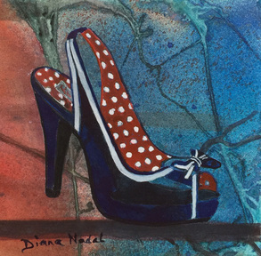
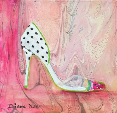
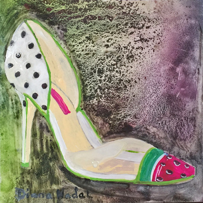
I started with a Valentine tribute and I wanted to end with a Valentine tribute because what a wonderful holiday to express your love to your family and friends in a special way. Hopefully it isn't the only day where we focus on those special people in our lives. I really loved how the marbled design radiates hearts from the shoe -- I used several pinks, reds, magentas and jeune brilliant for the inner sole. I had one more piece of that original painting that I thought would do justice to this beautiful shoe. The colors aren't quite as bright as I wanted but I was running out of time today. I do have other things to get done today. I used phthalo blue, perinone orange, Hansa Yellow Lt, Skip's Green and a touch of black to outline. There is something about this color on Yupo that makes any painting look good. I had to rewet the background at the end and actually it is still wet when I took the photo . I love the background and I really love how intricate the pattern on the shoe is considering they were dealing with the materials of the shoe. Love the open toe as well. Hmmmm another shoe I'd love to have in my closet and I already have a few outfits to go with it. 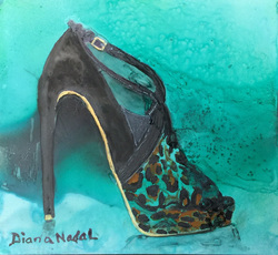 Today I've worked on two paintings that are painted on different surfaces and the the backgrounds were painted earlier. The Aqua Leopard Pump 6x6 Watercolor on Yupo. I sprayed the background with several of the turquoise and aqua Dr. Ph. Martin Hydrus Watercolors -- even a little of the Payne's Gray which helped to darken parts of the background. I babysat my painting and swirled it as often as I could to get a difference in the color as it was drying. I even applied some additional Aqua after the shoe was completed to get a little different texture on the right side. The shoe was painted with Lamp Black, Burnt Umber and Blue Aqua. I do love "slings" so this shoe appealed to me from the beginning. With a love of Africa as you can see over time in my paintings there had to be some wild animal influence in the shoes as well. Aqua Leopard Pump 6x6 Watercolor on Yupo Being resourceful I cut up one of my painting's from last year's challenge that wasn't one I was totally happy with trying to make the design better. The background was perfect for this shoe when I was trying to match it. My Mom loved polka dots and as I was growing up she made me a little fur jacket with red polka dot lining and when I saw this shoe I knew it had to be painted. I also wore a one shoulder black and white polka dot with three tiers of lace short dress to one of our formals in high school -- so the polka dots bring back good memories. I used Dr. Ph. Martin Hydrus Watercolors: Ultramarine and mixed a little black with it in the shadowing on the shoe. I used White Gouache to make the white stand out from the underpainting. I used Vermillion Hue for the red. It does take several layers of intense paint to cover when you have backgrounds like this one if you don't want it showing through. Well I'm painting in the "groove" and can't seem to stop. I know I'm going to go through withdrawals at the end of this Challenge!! I'm going to post the three paintings I worked on yesterday and today. Since I started a few days late I might even catch up and get 30 paintings in the Challenge.
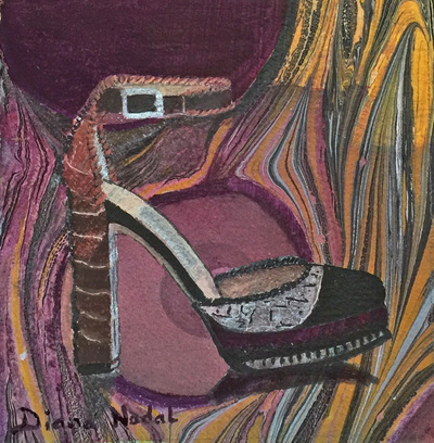
The first one is a more casual pump which attracted me to a different kind of fantasy setting on where you could wear such a shoe. I love the different leathers he used in the design of the shoe. I've always like purple and it was an intresting combination of brown, orange, gray and purple leathers on different parts of the shoe. I used the marbled paper because I thought it would show off the colors and textures better than other papers I could have used. I did have to highlight the paper to make it all happen and bring the shoe forward. The marbled paper was almost like tissue paper and so wetting it again both on the background and in painting the shoe was a little more difficult but because the marbling is acrylic paints I think it held it together. I like this one a lot better than the one on Yupo. It speaks to what I wanted to portray. Summer will be coming and wouldn't it be fun to have a pair of shoes to wear to the first summer party! It was a little difficult to get the clear part of the shoe to appear with the busy background but watered down white gouache seemed to do the trick on both paintings. Gene Gill always said to use whatever tools you need to finish a painting and he used gouache a lot in his awesome paintings. Thanks Gene!! The paint went crazy when I mixed these particular colors for the background -- obviously the characteristics of possibly Skip's Green didn't like the other pigments? The salt added to the texture which I think is a mistake on Yupo. There are two versions of this shoe because I really wasn't sure I could even pull this one off. Sure need to sign it again if I finish it behind glass or acrylic. Well, here is a painting on Yupo (a plastic used by the printing industry) I mentioned several days ago. It is a very slick and nonporous surface so the paint sits on top. Most of the time I burnish the wet paint to set it before applying any other colors or layers. I just let these sit. The colors always remain exactly as they were applied. I did move the board around so the pools of color could flow in different directions. With the wet weather it took awhile to dry.
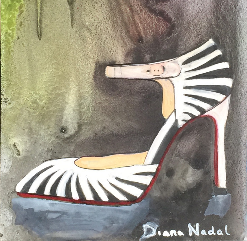
I was a little disappointed because I did masque the whites in the shoe but the masque didn't want to come off easily on this surface. I also applied some sea salt to the surface and that isn't what I would do in the future. Many layers were applied using white gouache and I added more black to the shoe itself. I really think this pump is outstanding but spending many hours painting it, I'll have to stand back and not look at it for a day -- hope you enjoy looking though. I still might create a dark shadow under the shoe before finishing and sealing this or putting it under glass -- whichever I decide. Yupo actually looks great under acrylic or glass. Black and White Striped Pump 6x6 Watercolor and Gouache on Yupo I actually painted ahead a day in the event since I was so motivated. This really is a fun and comfortable pump. I brought out the colors a little more than the original shoe. I don't think it is for sale any longer but I will check it out before going on my shoe shopping trip some day very soon. It reminds me of Oregon State colors -- for all you alumni!
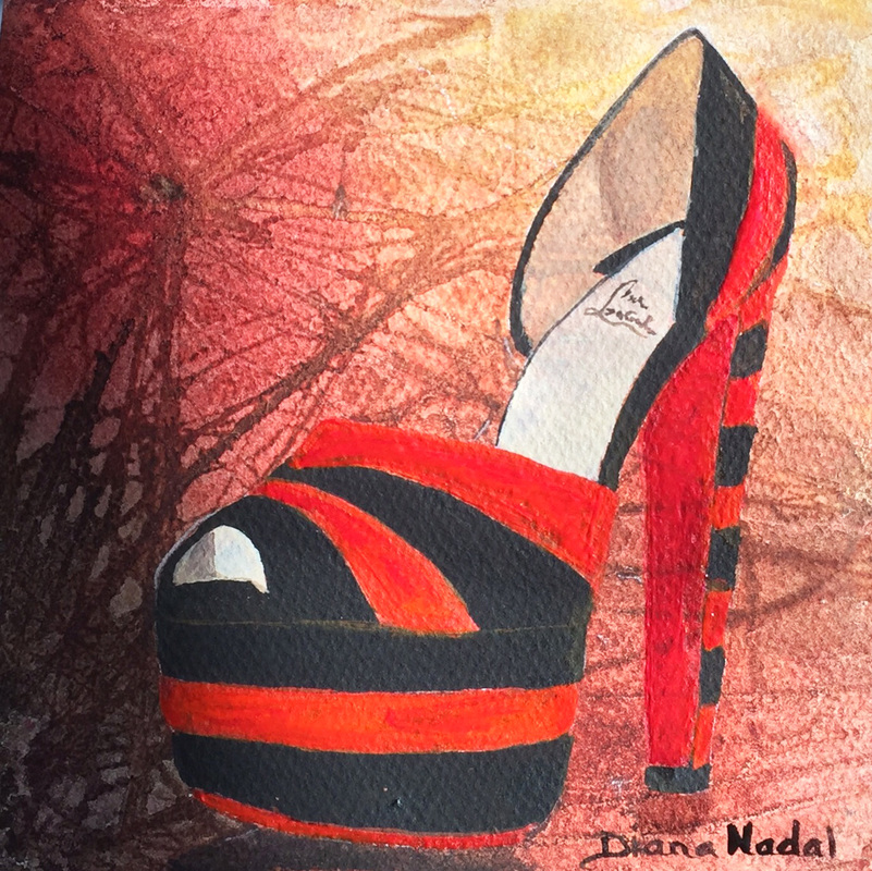
This is one of the backgrounds I painted at the beginning of the Challenge using the webbing and spraying with Dr. Ph. Martin Hydrus Watercolors. I did enhance the background with a little of the Quin Coral from Daniel Smith. I also used about three different orange reds to make the shoe "pop": Quin Coral, Perinone Orange, and Cad Red Light--first wash. These colors were fairly transparent and needed many layers to paint over the background. Sometimes I like to leave it showing through but this time I was trying to paint over it. Striped Orange and Black Platform 6x6 Watercolor on 300 lb Fabriano |
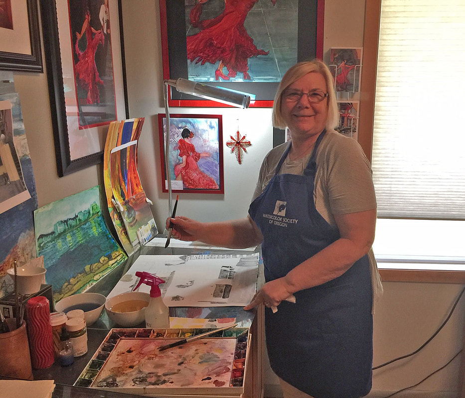
AuthorSharing my paintings with others is one of the joys in my life. Educating others about how I paint and the media I use is very important and why I wanted to reach out through this blog. Hope you will add a comment about what you see. What else would you like to see here?. Archives
September 2020
www.dianagnadal.blogspot.com Link to Previous year blogs:
Categories |
 RSS Feed